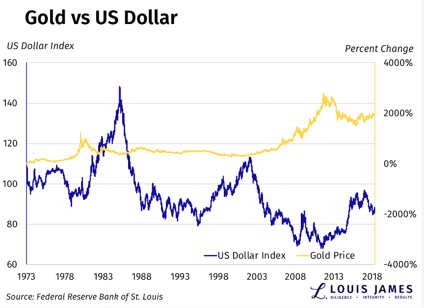
We’ve seen a very strong inverse relationship between gold and the US dollar over the last year. That’s no surprise, since gold is priced in dollars.
However, the two can also be seen as competing forms of money, as well as safe havens during volatile times. This means that sometimes they move together. This tends to be especially strong when people outside the US are experiencing economic chaos, and significant money flows into both the USD and gold.
That’s not the case today. Gold has been rising and the dollar has been falling, more ore less since candidate Trump called for a weaker US dollar.
With this in mind, this may be the only chart gold and silver investors need to see this year. (Please note that the axes for the US dollar index on the left and % change in gold prices on the right are quite different, and they are scaled to make the relationship easier to see.)

There are two key takeaways here:
- The periods of the USD and gold both moving up sharply together tend to be short-lived episodes, as in the late 1970s and after the crash of 2008.
- The current trend on the right-hand side of the chart shows the dollar dropping and gold rising roughly for the last two years. That’s more than a flash in the pan.
This is one big reason I’m bullish on precious metals, as well as commodities in general.
And I’m speculating accordingly.
![]()

